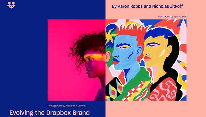
Dropbox has a new look!

Dropbox has redesigned their aesthetic and has introduced much more colour than its previous white and blue. The new look also includes an updated box logo that has a flatter, more modern, look that looks more abstract and less like an actual box.
This is Dropbox’s first major revamp in 10 years and the redesign will set them apart from their competitors such as Box, Google Drive and iCloud — who all use some version of blue in their logos.
The update also includes a new typeface called Sharp Grotesk which will also enhance the new look as a modern and fresh file sharing platform.
Dropbox is saying the new colour combination will help them stand out among the crowd of file-sharing services, as well as give a nod to the creativity of their users. They say the new look is closer to Adobe now than to Microsoft OneDrive.
Though the logo is new, most of the web and app user interface remains visually similar — with mostly white with blue and grey accents. The new colour combinations are most likely to be seen on marketing campaigns and ads than actual interface changes.
If you would like to learn more about Dropbox or our Cloud services, please be in touch with us at Google Pixel Buds — the new wireless translating headphones →← Mozilla launching Firefox Quantum next month
